

Student Org App Google Design Challenge
Google Design Exercise: Student Organization App
![]()
So this year I decided to try and apply for Googles 2019 UX design internship.
After getting through some part of the recruitment process we where given a design test/exercise.
We had to choose from 3 different options on what we are going to work on.
After giving it some thought I decided to go for the first, ux design heavy, exercise. Although I wasn't able to get the internship I still decided to share the entire case study here.
The task (Option 1):
Design an experience for new students to browse, search, and propose new student organizations. Provide your overall process, a wireframe flow, and one to two screens at higher fidelity.
- Understanding the problem
Before we start solving anything we should take a look at the issue at hand and break it down to its roots.
First thing, there is a huge amount of student organizations with a lot of different options. Harvard offers a option of almost 500+ different student organizations. From that we can understand that managing and displaying that huge amount of information can be quite challenging.
Further research shows that a lot of students have trouble with finding the right student organization that truly fits them. That problem on itself can give us a fun way to gather information from the users and then help them decide on witch student organization suits them the best.
Last thing that we can try to improve is making the option of proposing new student organizations truly user friendly and fast. This way, any student can send and propose their idea on a brand new student organization.
2. Solving the problem
Regarding all the info that needs to be displayed, I plan on grouping them by types while also giving the option of searching them individually. This way, the user can have nice looking groups and also short and simple list views of the exact student organizations.
Gathering info about the users could be done with a multi-select tool where the user can search predefined interests and mark them as selected. I plan on placing this screen right after the welcome page where the user can fill it out and then have custom grouped student organizations on the home screen. This option could also be skipped if wanted.
Proposing a new organization would be done easily with a couple of forms. After the proposal is sent, the user will get a section on his profile where he can see and check the status of the proposal.
3. Research
I started out with some brainstorming to explore the topic, and then moved on to researching online about different ways I can display some of the features.
First thing I looked for was different ways of dealing with huge amount of information since I plan on displaying student organizations in a well organized list view. I was able to find a couple of articles on handling long list selection in android.
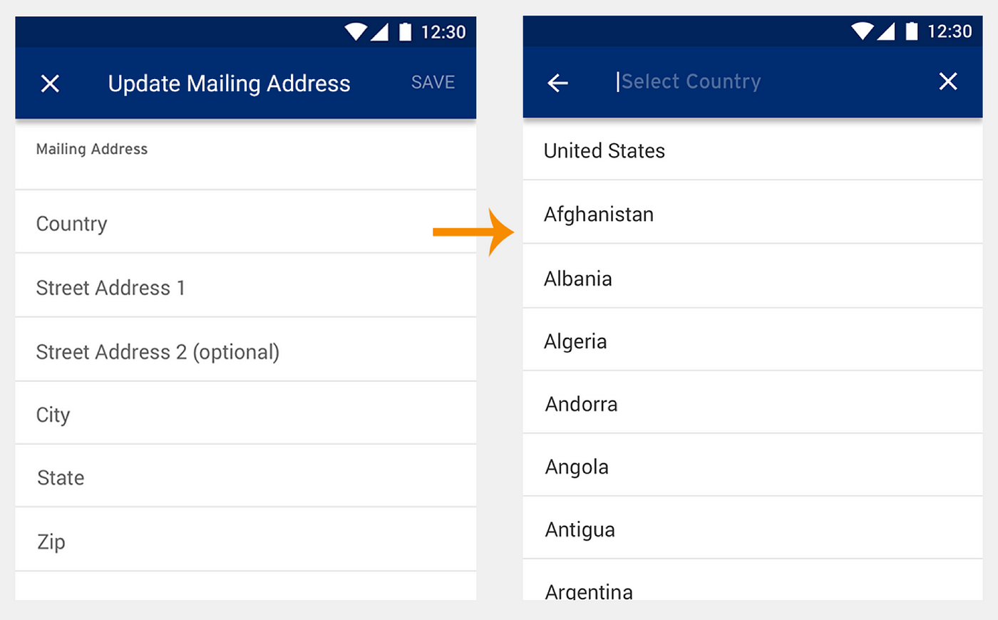
This is just a example of searching a long list of countries but I could use a similar way to view and search different student organizations.
Regarding the login/sign-up I wanted to give the option of using the app without signing-up. The screen will need to shows up if the user tries to propose a new student organization or tries to open the profile while not signed-up. I didn't want to bother the user with too much forms at the very beginning since the statistic show that most users leave because of being lazy to fill in too much info.
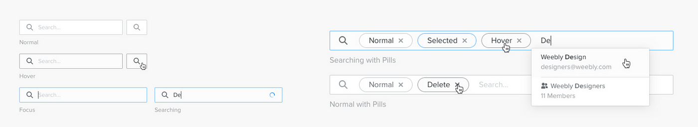
While giving the option of a user choosing his interests I wanted to use a multi-select feature. Having the ability to view what you selected while also having the option to unselect/remove can work really well in this situation. Thus I wanted to do some research and check out the best ways I can implement something like this.
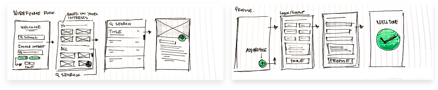
4. Sketches and wireframes
Some early sketches, flows and ideas.
Here we have the overall flow of the app, how the screens look, work and connect.
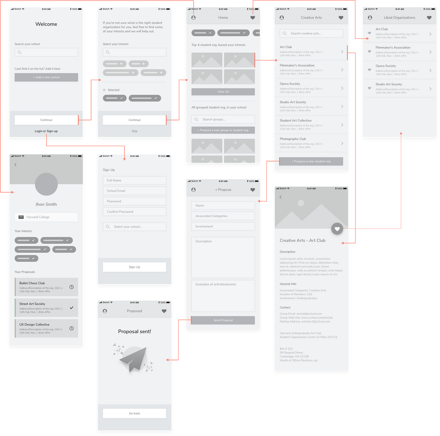
Onboarding:
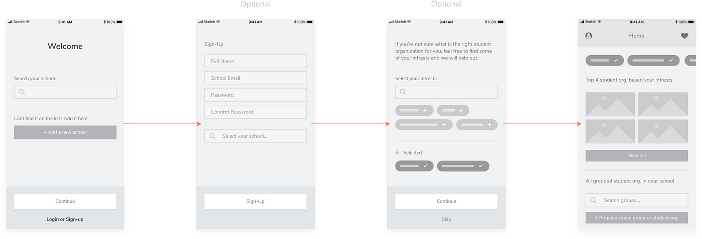
The welcome screen features just a search box where the user can find and select the school he goes to. He also has a option of adding his own school if it's not on the list, the login/sign-up button is included as well.
The interests view features a search box that has a autocomplete suggestions down bellow. If the user wishes to add something he can simply tap on the option and it will be moved to the "Selected" section where it can also be moved back later on.
Exploring:
1. Once you finish with the setup, the app will take you to the Home screen where the user will be able to browse student organizations by groups. At the very top, if he selected the interests, the user will have a top 4 suggestions based on the stuff he chose. He will also have an ability to view them all, and be able to see and interact the interests he chose at the very top. The bottom half of the page would display all of the groups, and a search box for them. Users can also propose new student organizations right from the home page.
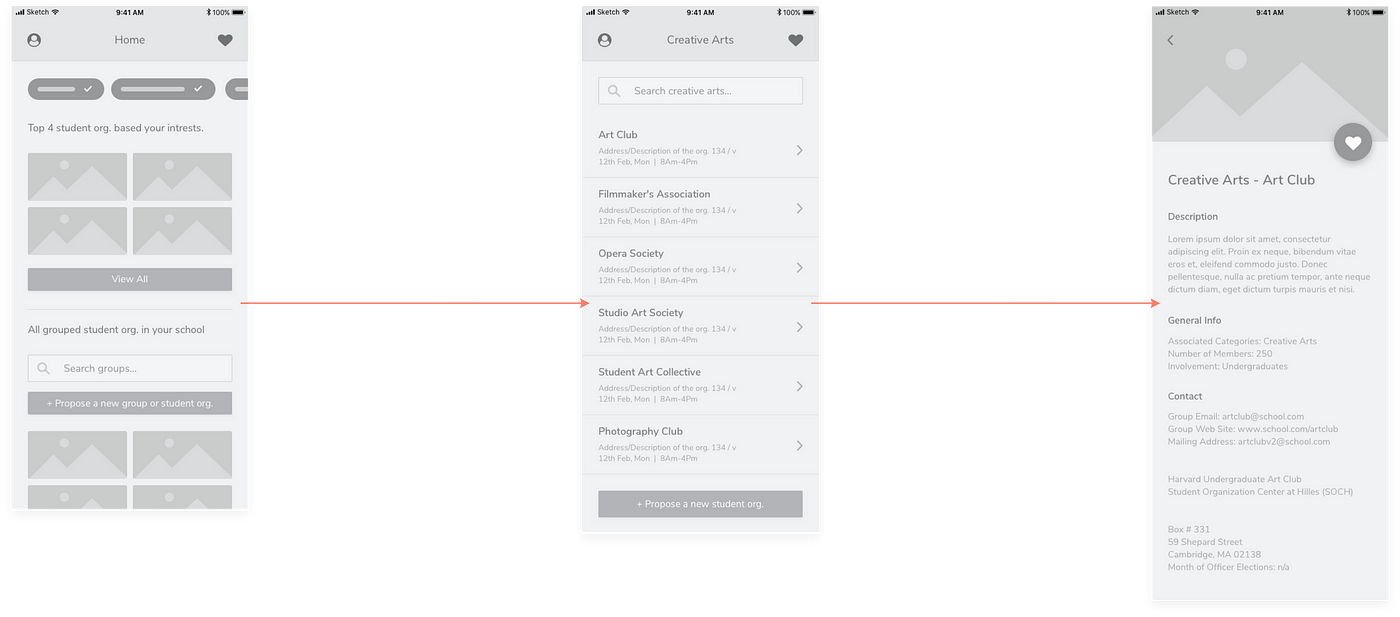
2. When a group is opened up, the user will get a user friendly list view of all the student organizations in that particular group. They will have an option to search the entire list of needed.
3. Right after opening a student organization from the list, the user will be able to see more details. At the top half, the screen would display a picture of the activities and a ""Favorite"" button witch would move the item to the users ""Favorites" list" and also have that student organization considered as a users interest.
The info would include a description and general info pulled from the Harvard website that the user actually needs.
Proposing:
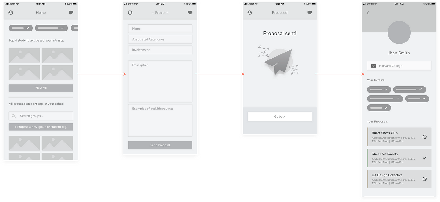
1. Throughout the app, the user would have lots of ways to propose a new student organization.
2. Once the user openes a screen he will get a couple of text boxes that he needs to fill in. Stuff such as the name all the way to the examples of activities that the student organization would perform.
3. If all the forms where successfully filled and the users was logged in to his account, the user will get a ""Proposal sent"" screen informing him that the proposal was successfully sent.
4. After that, his profile will get a new card in the ""Your Proposal"" section. The card would include general info on the student organization he proposed and would have an icon plus color status.
5. Higher Fidelity
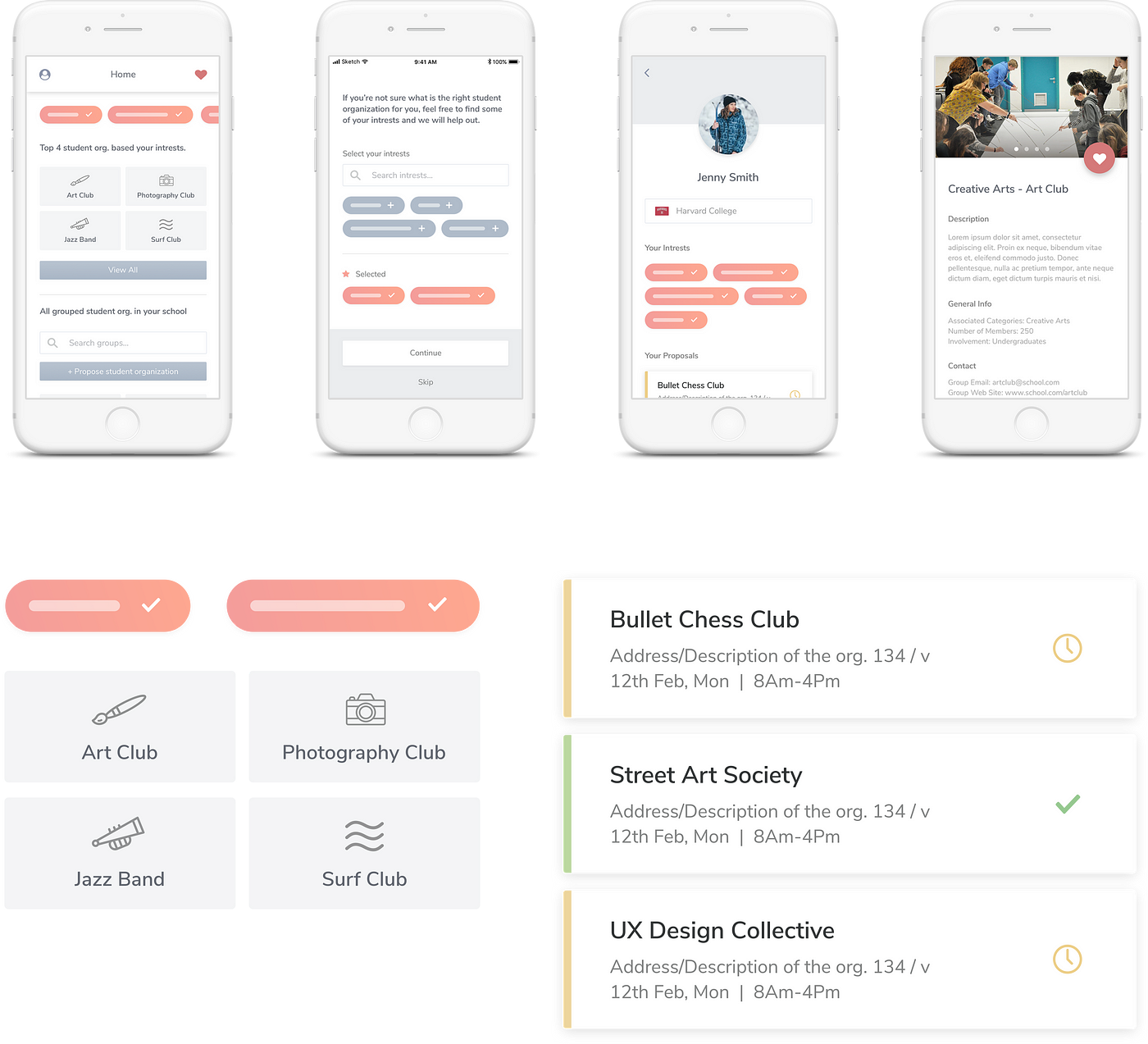
For the font. I wanted to use Nunito Sans since it''s one of my favorites and I think it could work well for student type apps . The color pallet I choose consists of pastel colors and some gradients to grab the users attention.
The overall style I went for is more of like a simple yet modern look.
I also wanted to group the action buttons with the same color and relatively same style. The whole ui is focused to support the ux and help the user navigate quickly threw the app.
6. End goal
I believe that an app like this could really boost and help the way students interact with student organizations. Having the ability to search and view every single student organization while also proposing your new ideas will definitely spark more interests for student to join.
A product like this could later on be expanded into a well organized student application with more features to boost productivity. Connecting it to other Google products like Google Calendar and Google Drive could really make a difference in a students everyday life.
Thanks for taking a look!
Student Org App Google Design Challenge
Source: https://medium.com/@vukojicic.nv/google-design-exercise-student-organization-app-5179f34e9f7c
Posted by: joneslieve1996.blogspot.com
0 Response to "Student Org App Google Design Challenge"
Post a Comment